
This article contains affiliate links. We earn a small commission on purchases at no extra cost to you.
Walk into a home decorated by someone who rides, and you know it immediately. Not because there's a horse on the wall. Because the room feels a particular way — warm, specific, grounded in something real. The leather is worn in. The brass is aged. The objects look like they earned their place.
Walk into a home decorated at equestrian style, and you know that immediately too. The horse figurines on the shelf. The "live, love, ride" sign above the door. The throw pillow with a jumping silhouette. Everything gestures at horses without connecting to them.
The difference between these two rooms is not budget. It's not access. It's whether the style came from living the life or shopping for the look.
This is the distinction worth understanding before you buy a single thing.
The materials that do the work
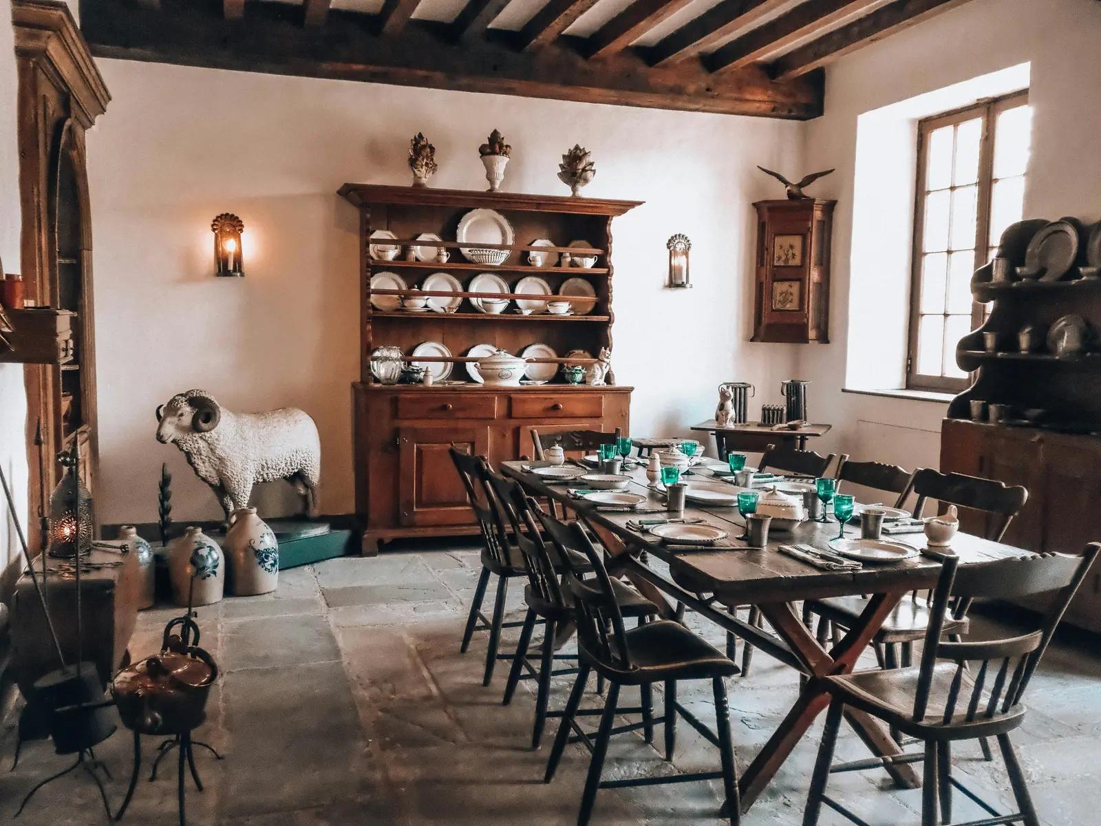
Equestrian style has a material vocabulary. Learn it, and the aesthetic follows without effort.
Leather. Not faux, not bonded — full-grain leather that ages with use. A leather cushion, a leather-bound journal on a coffee table, a leather belt hung on a hook. Real leather darkens and softens over time. That patina is the point. It signals that something has been used and cared for, which is exactly what the equestrian aesthetic communicates at its best.
Brass. Aged, not polished to a mirror shine. Brass hardware on furniture, brass hooks, brass picture frames, brass candleholders. The warm gold of aged brass sits naturally alongside leather and wood in a way that chrome or nickel never does. It's the hardware of the tack room — and it translates directly into the home.
Dark wood. Walnut, mahogany, oak with a deep finish. The furniture of barns and tack rooms is almost always wood, chosen for durability and warmth. The same qualities that make a wooden saddle rack beautiful in a barn make a dark wood console table beautiful in a hallway.
Linen and wool. Natural textiles in warm, undyed tones. A linen throw, a wool blanket in a deep neutral, a jute rug. These are the textiles of barn life — functional, durable, tactile. In the home they add warmth without weight.
Iron. Matte black or aged iron for hardware, hooks, and lighting. It reads as utilitarian and honest — the same quality that makes a good barn fitting look right. In the home, it grounds spaces that might otherwise feel too soft.
“The equestrian home doesn't announce itself. It reveals itself slowly — in the weight of the hardware, the smell of the leather, the grain of the wood.”
Restraint as a design principle
The single most common mistake in equestrian home decor is accumulation. More horse objects, more equestrian prints, more barn-themed accessories — until the room stops feeling like a home and starts feeling like a gift shop near a horse show.
Restraint is not minimalism. It's intention.
One well-chosen piece does more work than five undistinguished ones. A single bridle hung on a brass hook in an entryway is a statement. Five bridles on five hooks is a tack room. The difference is not the objects — it's the editing.
Every item in a room should earn its place. Not because it has a horse on it, but because it is genuinely beautiful, genuinely useful, or genuinely meaningful. When something qualifies on all three, it belongs. When it qualifies on none of them and just looks equestrian, it's a prop.
The rooms that feel most authentically equestrian are almost always the ones where the rider stopped adding things before they wanted to. That restraint is visible — and it's what makes a space feel designed rather than decorated.
Things that belong in the barn — and look even better in the home
The most authentic version of equestrian home decor doesn't come from a shop. It comes from the barn.
Real objects, used with intention, carry a weight that no manufactured equestrian-inspired piece can replicate. They have a history. They fit a particular hand or a particular horse. That specificity is what makes a room feel lived-in rather than styled.
A bridle on a wall hook. A well-maintained leather bridle hung on a wall hook reads as both beautiful and honest. The stitching, the hardware, the smell of conditioned leather — these are details that a manufactured wall piece can never replicate. It carries the history of the horse it was fitted to and the hands that maintained it. Cleaned and hung with intention, it's a piece of functional sculpture. It doesn't need a frame or a label. It speaks entirely for itself.
A saddle as a statement piece. A saddle on a proper stand beside a framed photograph — of the horse, of a competition, of a place — is the kind of composition that stops people in a room. What makes it work is the specificity. This isn't a generic equestrian object. It's a saddle that was broken in, adjusted, used. The tree has taken shape. The leather has darkened in the places where the most contact happens. That kind of object brings something into a room that no decorator can source — it brings a life. Pair it with a photograph that means something, and the composition tells an entire story without a word.
Stirrups as bookends. A pair of stainless or brass stirrups holding a row of books is one of the cleanest translations of barn to home. They're weighty, beautifully proportioned, and entirely purposeful in their original form. Repurposed as bookends, they do a new job without pretending to be something they're not. That combination — real material, honest function, new context — is exactly what makes barn-to-home decorating work when it works well. They look intentional because they are.
A horseshoe as a candle base. A clean horseshoe — ideally one with actual history — laid flat as the base for a pillar candle is the kind of detail that makes guests stop and look twice. It's warm, it's heavy, it's specific. The iron has a quality that no cast replica can match, and the shape is instantly legible without being obvious. It earns its place on a mantel or a side table not because it announces "equestrian home" but because it's genuinely beautiful in the way that well-made functional objects always are.
These objects work because they're real. Not inspired by horses — from horses. That distinction is the whole philosophy in a single sentence. A manufactured piece tries to borrow the feeling. The real object simply has it.
The entryway is where this philosophy is easiest to execute — one hook, one object, one first impression. If you want a guide on how to set this up so it remains edited and flows into your house naturally, this is the place to start.
Color and texture over motif
Equestrian style has a palette. It doesn't have a logo.
The colors of a well-kept barn are warm neutrals — parchment walls, cream ceilings, the cognac of oiled leather, the warm gold of brass, the deep espresso of dark wood. These aren't chosen for aesthetics. They're the colors of functional materials that happen to look beautiful together.
In the home, the same palette works for the same reason. Warm whites and creams as the base. Leather, brass, and dark wood as the anchors. A deep hunter green or a warm sage as the single accent that signals intention without demanding attention.
What the palette doesn't include: gray. Gray is the default of contemporary interiors, and it works in many contexts. In an equestrian home it reads as disconnected — too cool, too neutral, too far from the warmth of the barn. If you've been defaulting to gray and the space feels like it's missing something, this is often why.
Texture does as much work as color. A smooth leather surface beside a rough linen weave beside the grain of dark wood — that layering of textures is what makes a room feel rich without being expensive. It's also what gives equestrian spaces their particular quality of being interesting to look at without being busy.
Heritage over trend
Equestrian style has been the same for a long time. The materials haven't changed. The palette hasn't changed. The objects haven't changed. That consistency is not a limitation — it's the whole point.
A piece of furniture with real joinery and solid wood will look right in an equestrian home in twenty years. A trend piece bought because it had a vaguely barn-adjacent silhouette will look dated in three. The investment framing that applies to tack applies equally to home furnishings: buy once, buy well, buy things that age beautifully rather than things that age visibly.
Heritage brands in furniture and home goods — makers who work in solid wood, hand-finished leather, and traditional joinery — produce pieces that fit naturally into equestrian interiors because they come from the same place aesthetically. Craftsmanship, longevity, materials that improve with time.
Fast equestrian décor — the horse-motif mass-produced accessories sold at large home goods retailers — does the opposite. It dates quickly, ages poorly, and reads as themed rather than genuine. The price point feels right in the moment and wrong within a season.
What cliché actually looks like — and how to avoid it
Cliché in equestrian home decor is not about loving horses too much. It's about reaching for the symbol instead of the thing itself.
The horse motif on everything. A horse print on the cushion, a horse sculpture on the shelf, a horse painting above the fireplace. Each one individually might be beautiful. Together they become a theme, and themes are the enemy of a genuinely designed room. One strong equestrian piece anchors a space. Three competing ones make it feel like a gift shop.
Kitschy equestrian goods. This is the category worth naming directly, because it's everywhere and it's tempting. The ceramic horse cookie jar. The horse-print tea towels. The resin figurine in a jumping pose, painted in colours no real horse ever wore. The novelty mug with a cartoon mare and her foal. These items share a design language — rounded edges, bright colours, illustrated rather than realistic — that was built for impulse purchases, not interiors. There's nothing wrong with loving them. But they work against the equestrian aesthetic specifically because they flatten something complex and specific into a logo. A real bridle communicates decades of craft and relationship. A cartoon horse on a dish towel communicates neither.
Equestrian-inspired mass market goods. Products marketed as equestrian-inspired are almost always designed for people who like the look, not the life. The bridle hardware on the handbag that wouldn't function as actual hardware. The "barn wood" finish on MDF. The bit-shaped drawer pull in pot metal. Horse people can identify these immediately, and the inauthenticity undermines the whole room.
Sentimental clutter. A well-mounted ribbon from a meaningful competition is a piece of history. Forty ribbons tacked to a wall because you can't decide which ones matter is visual noise. The edit is the design. Choose the ones that mean the most and display them with intention.
Text and signs. "Happiness is a warm horse." "She believed she could, so she did." Any version of this category belongs in a different aesthetic. Equestrian style is specific and quiet — it doesn't announce itself with lettering.
The test for any piece is simple: would this look right in a room that belongs to someone who actually rides — or does it look right in a room that belongs to someone who wants to? The first is equestrian. The second is equestrian-themed.
That said — if a kitschy piece genuinely brings you joy, don't throw it away. Find it the right room. A guest bathroom, a children's bedroom, a basement, a mudroom — spaces with lower design stakes where personality and whimsy are completely at home. The goal isn't to eliminate everything that doesn't meet a standard. It's to keep your primary living spaces coherent and let everything else have its own place to be exactly what it is.
Pick your style — and commit to it
Equestrian decor divides naturally into two distinct worlds: English and Western. Both are legitimate. Both are beautiful. The mistake is mixing them without intention.
If your barn life is English — the close contact saddle, the hunt coat, the double bridle — then your home should speak that language. Aged leather, dark brass, linen, dark wood, the palette of the tack room after a long show season. That world has enormous range within it, and it's worth staying inside it.
If your world is Western — the tooled leather, the silver conchos, the particular warmth of that aesthetic — then that's the language your home should speak. Turquoise, burnished silver, warm wood with a different grain, the textiles and colours of that tradition done well.
What doesn't work is an English saddle in one room and a rodeo buckle display in the next, without a deliberate curatorial reason for both being there. The spaces start to argue with each other. The eye has no place to rest. Instead of feeling like a home that belongs to someone specific, it starts to feel like a home that can't decide what it wants to be.
This is the room-to-room question worth asking before you place anything: does this piece speak the same design language as everything else in this house, or does it introduce a dialect that doesn't belong here? Refinement isn't about removing the things that make you happy. It's about finding the version of what you love that flows — so that every room earns its place in the same story.
If a piece doesn't fit the language of your main living spaces, that's not a reason to let it go. It's a reason to find it a room where it's at home. A beloved Western belt buckle in a glass shadow box means something specific. The same piece sitting beside English tack and a hound portrait just creates noise.
The gallery wall is one of the most effective ways to commit to a single design language without overloading a room. Done right, it tells the whole story in one place. When you're ready to build one — the objects, the frames, the sequencing — a full step-by-step guide is on the site.
How to bring it all together
The approach is the same regardless of which room you're working with, and it's simpler than most decorating advice suggests.
Start with the material layer. Floor, walls, and textiles in the equestrian palette — warm neutrals, natural fibres, wood, brass, iron. This doesn't require purchasing anything new. It usually requires editing out what doesn't fit. Look at each piece and ask whether it belongs to the material vocabulary of your chosen style. Anything that doesn't — the cool grey throw, the chrome lamp, the novelty item that snuck in as a gift — either finds a different room or leaves.
Decide on one design language and hold it. English or Western. Heritage or rustic. Choose the aesthetic your barn life actually reflects and build from there. The palette, the hardware, the objects — they should all speak the same dialect. When something introduces a different visual language without a clear reason, it creates friction the eye can't resolve. Consistency is not rigidity. It's what allows a home to feel like it was designed rather than accumulated.
Add one or two real anchor pieces. Not equestrian-inspired — genuinely equestrian. A real barn object given a second life, a piece of quality leather furniture, a framed photograph with actual meaning. These do the heavy lifting. Everything else in the room can be quiet because these pieces carry the story.
Let the kitschy pieces you love have their own space. If something makes you happy but doesn't fit the design language of your main rooms, find it a home where it belongs — a bathroom, a mudroom, a guest room, a child's bedroom. Those spaces have different rules and different stakes. A ceramic horse on a shelf in the bathroom is charming. The same piece beside a leather Chesterfield and a bridle on the wall is a conflict.
Stop earlier than you think you should. The instinct is to keep adding until a room feels finished. In equestrian decor, the room usually feels right two decisions before that point. The negative space — the wall that holds nothing, the surface left clear — is not emptiness. It's what gives the pieces that matter room to breathe.
A home that feels genuinely equestrian doesn't announce itself. It doesn't need to. The materials are honest, the objects have histories, the rooms flow into each other without contradiction. The person who lives there doesn't have to explain it — because it already shows exactly who they are.
When you're ready to move from philosophy to execution, these guides take the same principles into specific spaces.
Frequently Asked Questions
What is equestrian home decor?
Equestrian home decor draws from the materials, palette, and objects of horse life — leather, brass, wood, linen, iron — to create spaces that feel grounded, warm, and quietly specific. It's less about displaying horses and more about bringing the sensibility of the barn into the home. At its best, it looks designed rather than decorated.
How do I make my home look equestrian without being too on the nose?
Start with materials rather than motifs. Leather, aged brass, warm wood, and natural linen read as equestrian without naming it. Add one or two real barn objects used with intention — a bridle on a hook, stirrups as bookends — rather than a shelf of horse figurines. Restraint is the whole principle.
What colors work for equestrian home decor?
Warm neutrals are the foundation — parchment, cream, warm white, and sand. Layer in the colors of the tack room: cognac leather, aged brass, dark espresso wood, and deep hunter green. These read as equestrian through association and warmth, not because they feature a horse. Avoid grey, which tends to feel cold and disconnected from the aesthetic.
Can equestrian decor work in a modern home?
Yes — the materials translate well into contemporary spaces. Aged brass and leather against clean lines and neutral walls work precisely because they bring warmth and texture without visual noise. The key is restraint: one or two strong equestrian pieces in a modern room feel considered. A room full of them feels thematic.
What is the difference between equestrian decor and farmhouse decor?
Farmhouse decor leans rustic and broad — shiplap, mason jars, cotton stems. Equestrian decor is more specific and more refined. The materials are leather, brass, and dark wood. The palette is warmer and deeper. The objects have a particular function and history — a bridle has a story; a cotton stem doesn't. Equestrian style borrows from the barn, not the farmhouse kitchen.
The Elevated Tack Room Lookbook
15 finds every equestrian actually needs — curated, tested, and worth every penny. Free when you join the list.
No spam. Unsubscribe anytime.
Done
You're on the list. Check your inbox — your guide is on its way.